NSF-powered dashboards you should bookmark
Big Data is the new oil — researchers and businesses have said it for years. Though no longer new, data, like oil, requires refining, processing, and — so people can use it — an interface or dashboard. Data dashboards are visual means to communicate the key information provided by data in an easy-to-consume method the public can access.
Know the Johns Hopkins Coronavirus Resource Center with its famous dashboard? Scientists developed it to collect and analyze data on cases, deaths, tests, hospitalizations and vaccines to help the public, policymakers and healthcare professionals respond to the pandemic. The dashboard continues to monitor data on the status of COVID-19 around the globe.
The National Center for Science and Engineering Statistics, part of the U.S. National Science Foundation, also creates dashboards like the Science & Engineering State Indicators which compile information on the U.S. STEM enterprise. This dashboard, produced in collaboration with the National Science Board, compiles state-level information for 60 different indicators across six broad categories: elementary and secondary education; higher education; workforce; financial research and development inputs; research and development outputs; and science and technology in the economy.
Dashboards are key tools across all scientific disciplines, and NSF also supports dashboards created by other organizations across the U.S. Below are five NSF-supported ones you should bookmark to keep track of critical issues.
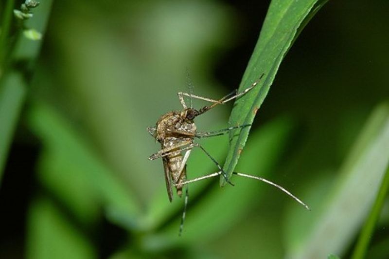
Tracking mosquitoes
Mosquitoes cause more than 1 million deaths each year and rank among the deadliest animals on the planet, even though only a small number transmit disease. Tracking and surveillance are crucial to mitigating the public health threat. Researchers at the University of South Florida created the Global Mosquito Observations Dashboard to monitor mosquito-borne diseases.
The dashboard aggregates data from other apps that rely on citizen scientists capturing photos of mosquitoes. The researchers tested the dashboard by asking citizen scientists to locate chikungunya, dengue, yellow fever and Zika vectors. The citizen scientists located the vectors and provided the first documented observations of an invasive mosquito species. The approach offers international data on a scale otherwise prohibitive due to expense and logistics, according to the researchers.
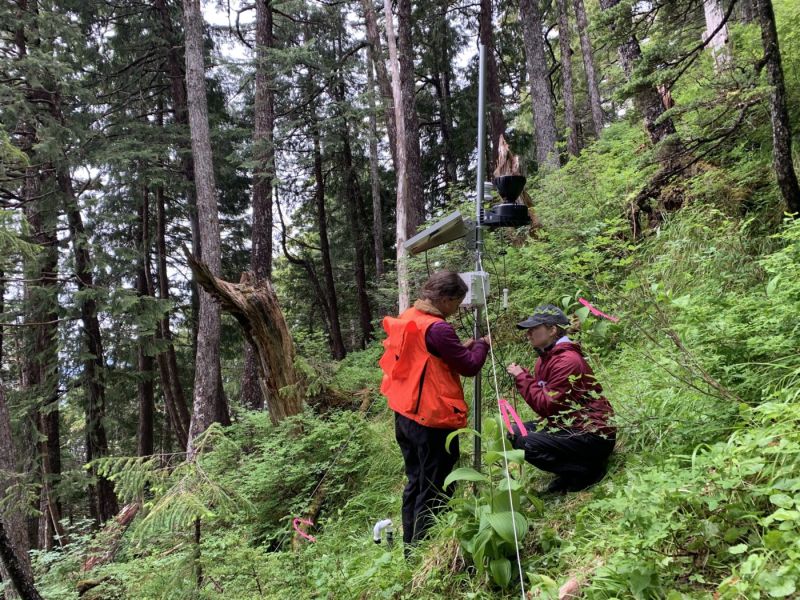
Impact of insects and diseases on forest health
Hosted by Purdue University, the Alien Forest Pest Explorer combines information from multiple sources to show the impact of different forest insects and diseases — and the potential for further damage. The dashboards, also supported by the U.S. Forest Service, overlay pest data with related data about the status and health of the host tree species in forests and has resolution down to the county level.
"We want to better understand the relationship between pests and tree hosts, as well as assess the vulnerability of our forests, so that we can make the best decisions to preserve and protect them," said Songlin Fei, a professor in Purdue's College of Agriculture and lead on the NSF-funded effort. "This was designed for everyone, not only for the professionals. Pest and disease prevention begins in your backyard. We want to put this tool in the hands of anyone who cares for trees so they understand what pests they may face, how to identify them and how to protect their trees and forests."
The history of U.S. energy
Energy use and climate change are closely linked, and addressing the consequences of a changing environment for the economy, food and water security, and energy supply is an increasingly urgent challenge. The U.S. Energy History Visualization project was driven by the idea that understanding past U.S. energy transitions can help guide future decisions and transform the world's approach to energy.
The dashboard, known as a Sankey diagram, uses line widths to represent per capita energy flows each year from primary energy sources to final uses covering 200 years of evolving energy use in the U.S. The project is intended to provide a deeper understanding about the potential future of society and the Earth and help policymakers make informed decisions. The NSF-powered project is an effort of the University of Chicago's Center for Robust Decision Making on Climate and Energy Policy and includes contributions from experts in economics, physical sciences, energy technologies, law, computational mathematics, statistics and computer science.
Landslide warnings for Alaskans
In Alaska, degrading permafrost, steep slopes, heavy rain, retreating glaciers and earthquakes are factors that can trigger devastating landslides. A landslide warning system developed in Sitka is now available to the public as an online dashboard.
The Sitka Sound Science Center spearheaded the effort to give residents information about the risks of a landslide in the area up to three days into the future. The Sitka Landslide Risk dashboard also provides recommendations on how to evaluate the information and what you should do if you decide to leave your home.
Development involved 30 scientists and university researchers working under a $2 million grant from NSF. Partners included the National Oceanic and Atmospheric Administration, the United States Geological Survey, the RAND Corporation and the Sitka Tribe of Alaska, which gathered oral histories.
Developers hope the dashboard can be expanded and become a regional landslide warning system. Work is already in progress to create similar warning systems for other cities and areas throughout Alaska.
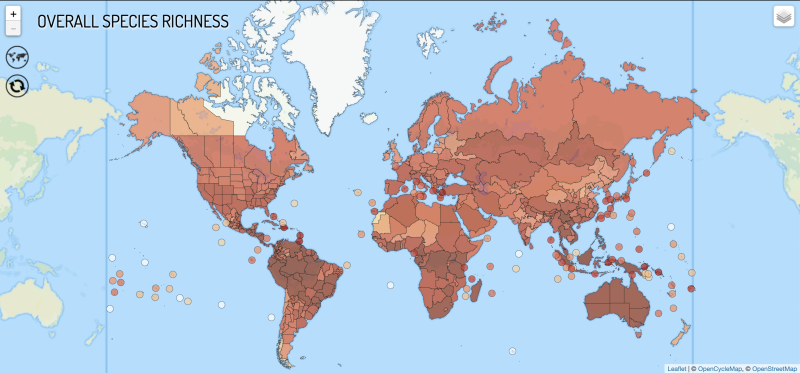
Monitoring the diversity of ant populations
With more than 14,000 ant species, ants outnumber humans by at least 2.5 million to 1. They also play a critical role in the global environment. And yet, some of the most basic information about ants remains a mystery. This makes it difficult to help conserve various species.
Researchers from institutions around the world stitched together nearly 2.5 million location records from research publications, online databases, museums and scientific field work to create Antmaps.org, the largest global map of insect diversity. The researchers hope this data will be used to direct future conservation efforts. The Global Ant Biodiversity project is led by Benoit Guénard and Evan Economo.
"This is a massive undertaking for a group known to be critical ecosystem engineers," said co-author Robert Guralnick, curator of biodiversity informatics at the Florida Museum of Natural History. "It represents an enormous effort not only among all the co-authors but the many naturalists who have contributed knowledge about distributions of ants across the globe."