
Let's get started!
Create a new page
The first step in authoring content in your content management system is to create a new page. Once you've created the page, you can add different component types using our layout builder. When you've finished adding content in the components, save your page as Ready for review and you're all set!
There are many combinations of layouts and component types you can use on your page. We'll cover a few of the basics on this page, but feel free to explore our additional resources as well:
- All the component types available
- Component type specs cheat sheet
- Best practices for using different components
- Accessibility tips and tricks
We've broken the process into 4 steps. Expand the accordions below to get started!
Log in to the NSF website
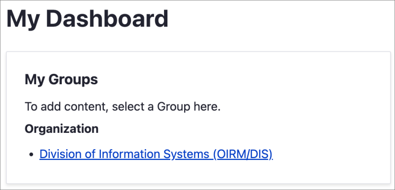
Select My dashboard from the top menu ribbon.
Under My Groups, select your organization or initiative.
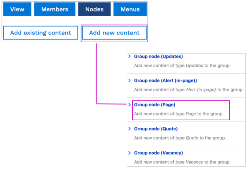
Once you've selected your organization, you can create a new page.
Select Nodes > Add new content > Group node (Page).
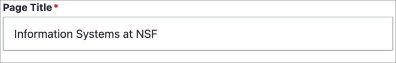
Give your new page a Page Title. Page titles should appear in title case. Titles don't support characters like subscript or superscript, or style enhancements like strikethrough, bold or italics.
All other fields for creating a new page are optional.
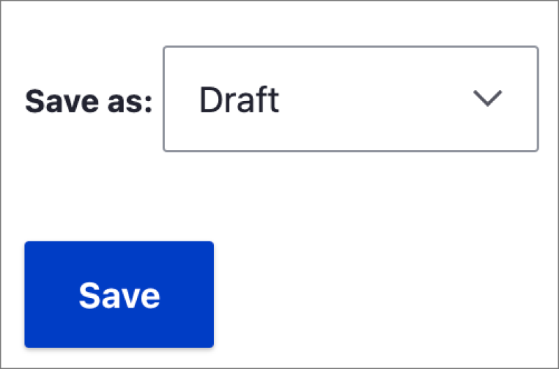
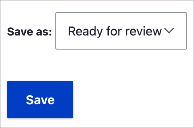
Choose Draft in the Save as: menu and select Save.
What's the difference between the statuses?
- Draft: The page is still a work-in-progress. It's only visible to members of your Organization who are logged in to the site.
- Ready for review: The page is content-complete and has your desired layout. It's ready to be reviewed by your normal reviewer in your Org. It's only visible to members of your Organization who are logged in to the site.
- Revisions needed: There is content on the page that needs to be revised. Once you've made the revisions, save the page as Ready for review again. It's only visible to members of your Organization who are logged in to the site.
Friendly reminder: As a content author, you can edit any page and the layout of any page which you've created, but can't edit any page you didn't create.
There are several content types you can add to your page. As you become more familiar with creating pages and adding content, feel free to explore all the component types available. For this training, we're going to focus on 3 tasks: creating a new layout section, adding a text editor, and adding featured content.
_________________________________________
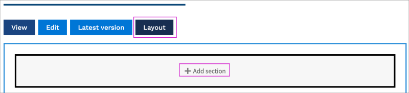
Add a new layout section
The Layout Builder is comprised of Sections and Components. Sections can be one, two or three columns, and components fit within them. Select Add section, choose how many columns you want, and then add components. You can move components around the page within each section by dragging and dropping the components where you want them.
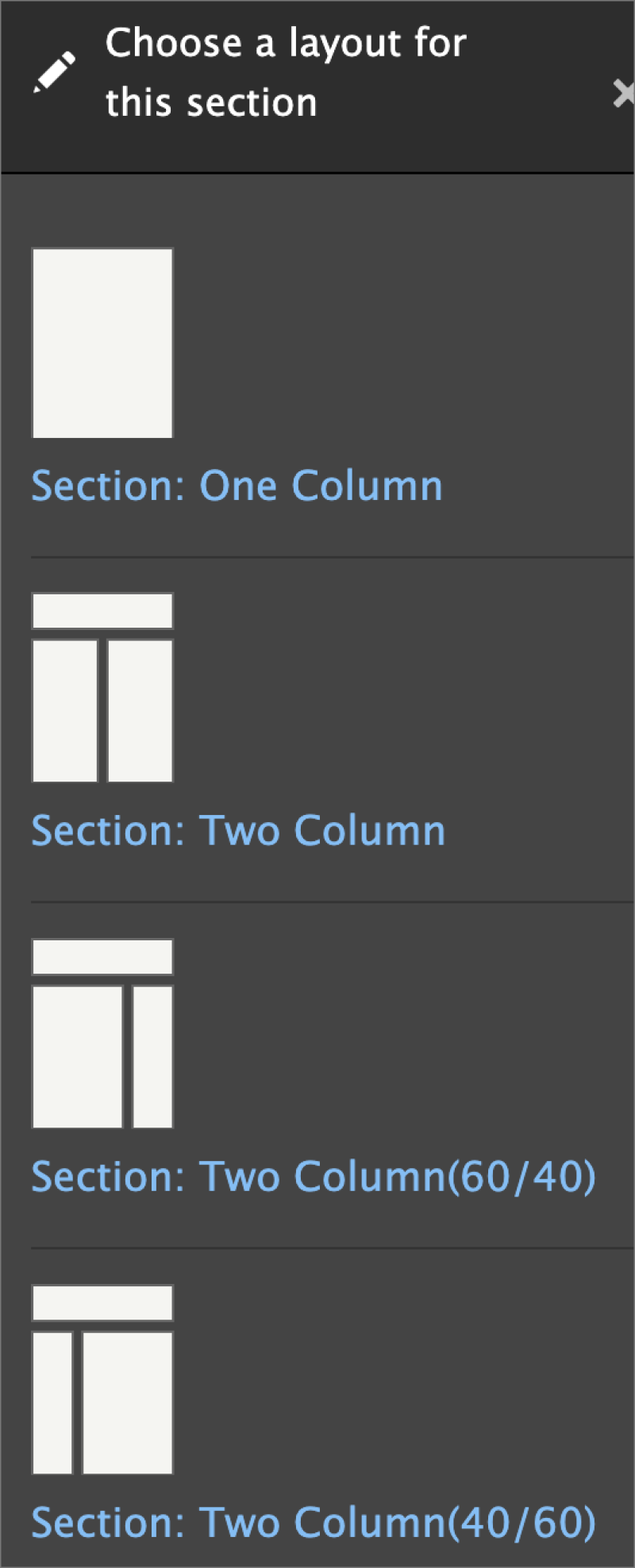
Select Layout > Add section. You can choose which layout works best for your page. Feel free to play around with the different columns and column sizes!
Select Section: One column layout for this training. There are optional configuration settings that you can fill out if you want. The title of the section doesn't appear outside of editing mode.
The last step is to add some content types to your layout with the layout builder. There are several content types to choose from; for this training, we'll focus on adding a text editor. Scroll down to get started!
Add a text editor
After you've added your layout columns, select Add component to add a text editor.
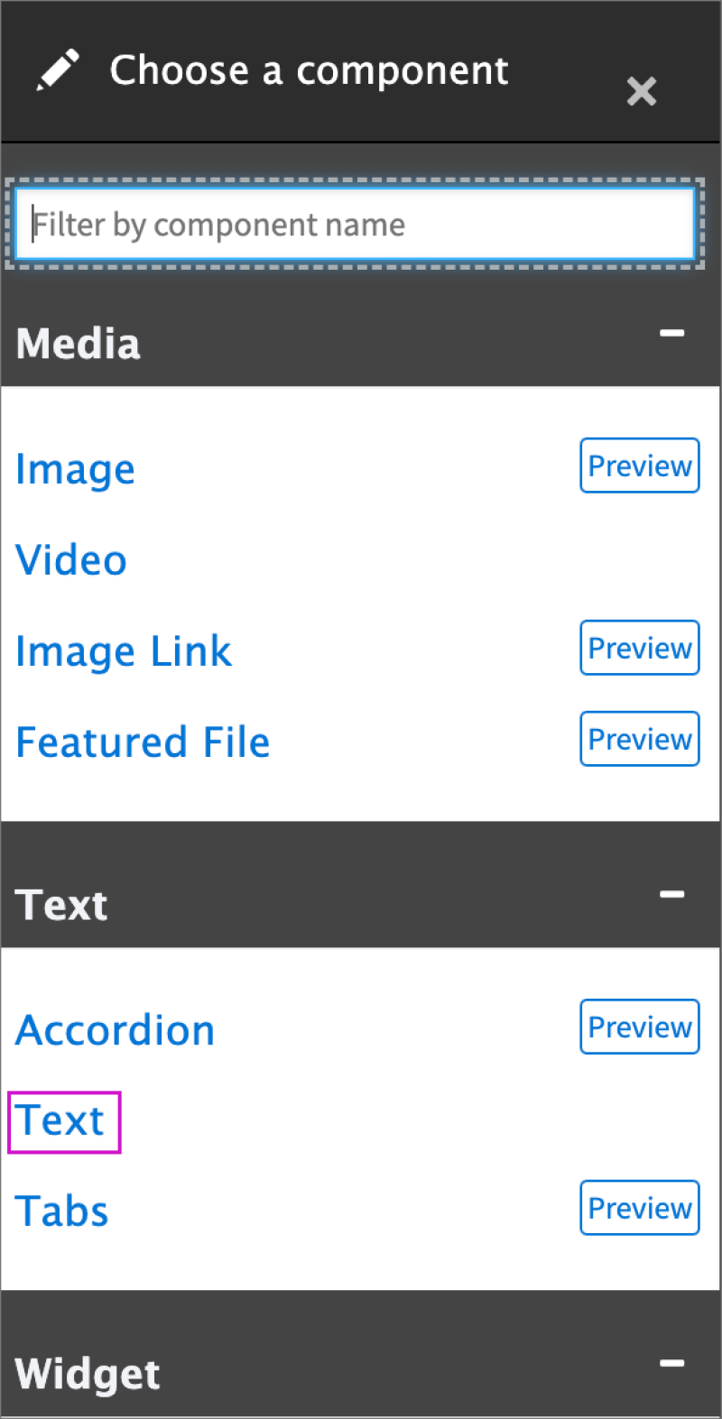
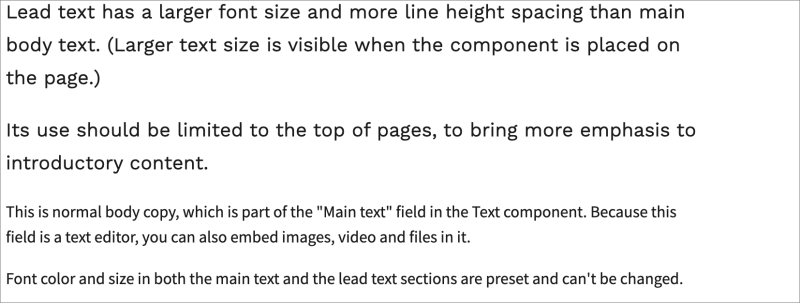
There are two pieces to a text editor, Lead text and Main text.
- Lead text has a larger font size and more line height spacing than main body text. Its use should be limited to the top of pages, to bring more emphasis to introductory content.
- Main text is normal body copy. Because this field is a text editor, you can also embed images, video and files in it.
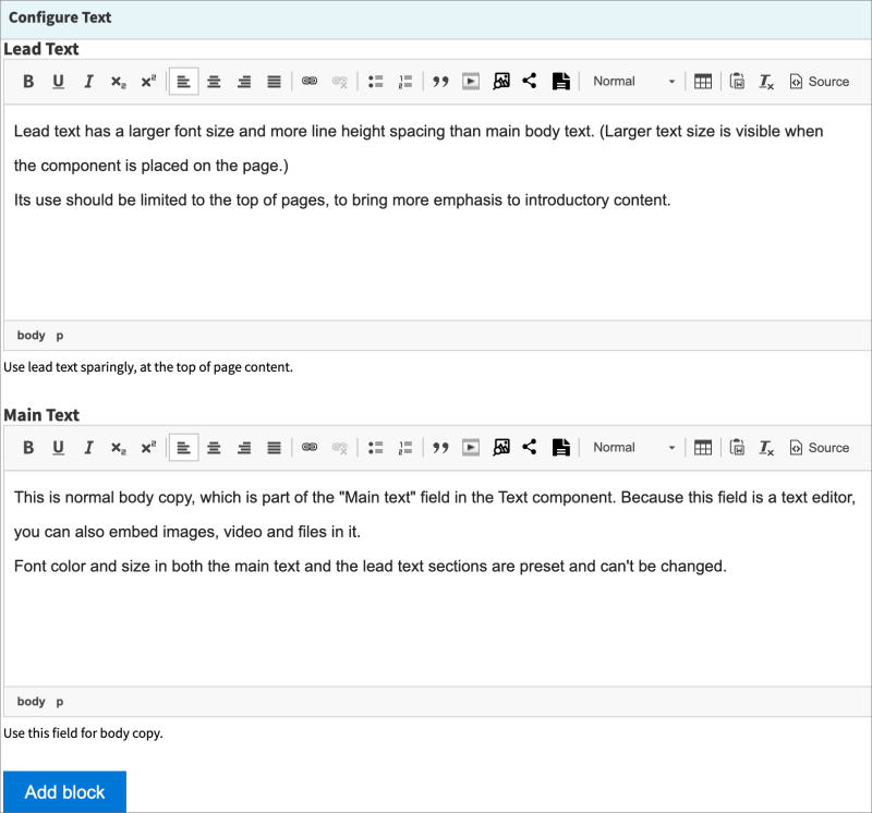
Font color and size in both the main text and the lead text sections are preset and can't be changed.
Select Add block > scroll to the bottom of the page > Save layout
That's it! You've added your first content type! Let's add another - we'll focus on featured content next. Scroll down to get started!
Add featured content
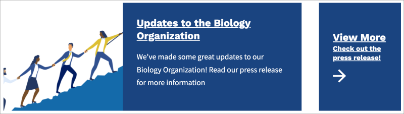
The Featured Content component is a great way to highlight important, interesting or timely content.
This component allows you to feature content horizontally or vertically. You can also add a "View More" link that can include a different link in order to take people to look at other information related to the featured content.
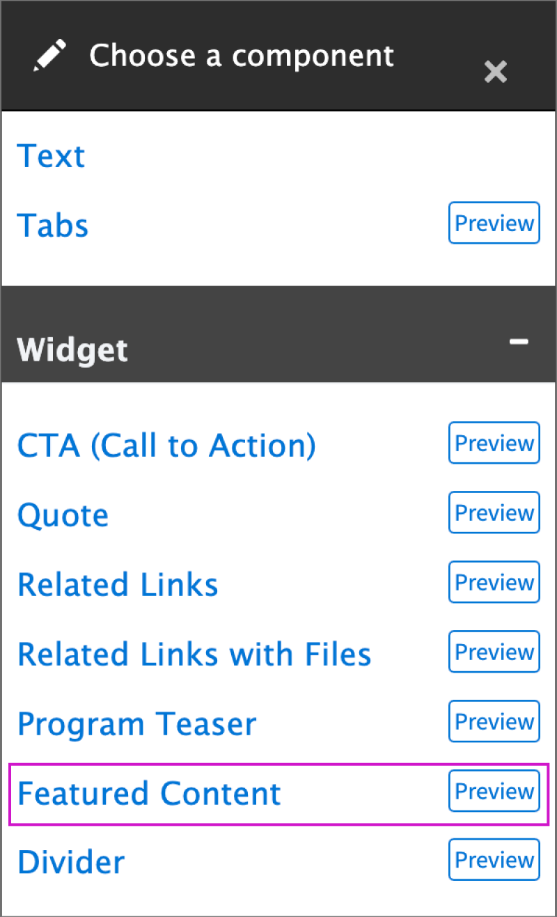
Select Add component > Featured content.
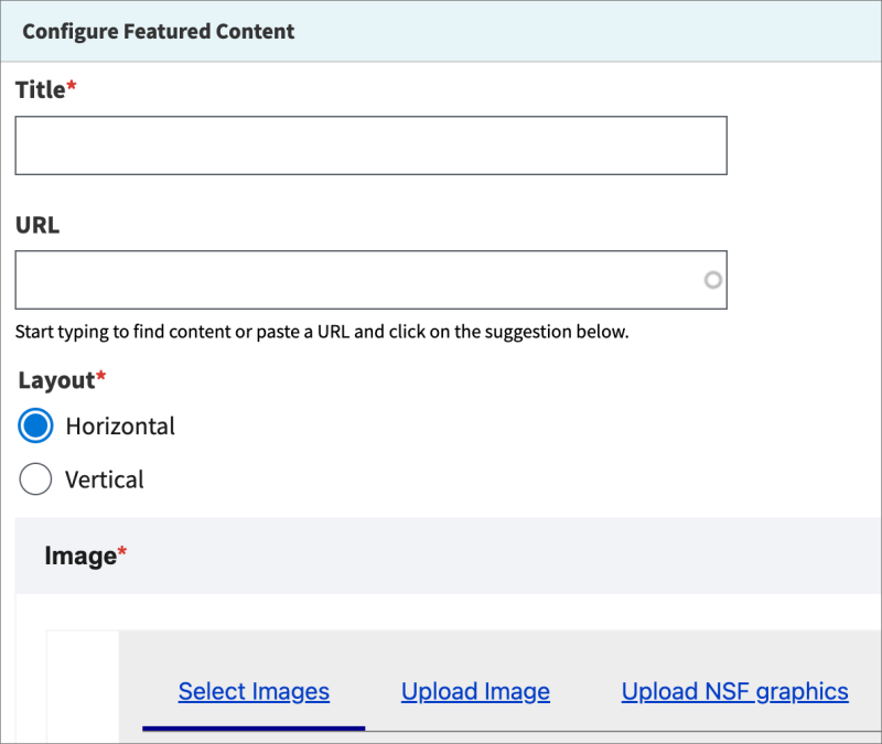
You'll need to add a Title, Layout, Image, and Short description to your featured content component. The other settings are optional; feel free to play around with these settings to change the appearance of your featured content!
There are two options for adding links to more information. Adding links could be helpful as there is a maximum character limit of 130 characters in the featured content description.
- You can embed the link in the title of the featured content component:

- Or you can use the "View more" configuration setting in the feature content component:
When you're finished, scroll to the bottom of the page and select Save layout.
When you're ready to send your page for review, select Ready for review from the Save as: menu. This sends your page to your dedicated reviewer who will either mark it as Ready for publishing, or as Revisions needed and they'll send it back to you.
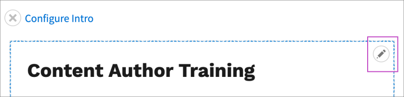
You can always edit your components and content on your page by selecting Layout > pencil icon at the top of your component.
Sample pages
Here are some pages that use the Layout Builder that are currently live.
- The Rotator Programs page features CTA Components and Accordions.
- The Job Types page uses a hero image with a headline.
- The e-Recruit Frequently Asked Questions page is a simple page using dividers to break up text, and Accordions.
Tips & tricks
- Editing the page title: Even if you're using the Layout Builder, if you want to edit the page title, hero image, menu settings or page tagging, you'll need to go back to the "Edit" page.
- Page columns and spacing: Nearly every page will have sidebar navigation. This means that the amount of room for your page Layout is smaller than it might seem while you're building your page. Keep that in mind and use three-column layouts sparingly.
- Hero images: Hero images are optional. Before using on on a lower-level page, ask yourself: "Does this image contribute specific, useful content to the page?".
- Linking: When adding a link to an internal page, search for the page itself in the URL reference field (the link icon in the WYSIWYG) rather than using the URL itself, so that if the URL ever changes, the link will still work.
More support content to come on the topics of using the Layout Builder, menu building, workflows and adding media.