
Creating a digital experience that is accessible to all users is not only the right thing to do, but it is also a federal requirement.
Who is responsible for website accessibility?
Everyone! If you are creating any type of content (copy, images, downloadable files, video, etc.), it is your responsibility to ensure your content is accessible to all and adheres to accessibility requirements and best practices.
Visuals and accessibility
Images
- It’s best to avoid text in an image or text-heavy graphics to communicate important information. Learn more about images of text.
- If there’s text on an image or graphic, it shouldn’t exceed 150 characters, as all of the text must be placed in the alt text field in the content management system (more on this below).
- Images, graphics with text and even PDFs should be created with color contrast and readability in mind.
Alt text describes images
Alt text is a brief image description that conveys the meaning communicated by the picture. It’s used by assistive technology (e.g. screen readers), search engines, and browsers (when the image can’t be loaded). Learn more about how to use alt text.
Note that if the image is purely decorative and conveys no meaningful information, you may use two quote marks ("") in the alt text field to indicate empty alt text. Use this decision tree as a guide to alt text for decorative images.
Conveying meaning
Remember, accessibility is about providing the same informational value to all users, and we want to be sure people aren’t missing out on important details.
Learn more about the image component or the image link component, where these kinds of decisions about accessibility will be made.
What not to do
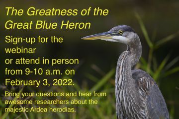
- This is an example of an image that would not be acceptable to add to your webpage for the following reasons:
- Too much text on the image - it is not a best practice to add that much text into the alt text.
- It is hard to read.
- If this is the only way you are presenting this information and the image does not load, everyone will miss out on critical information.
What to do instead
- Use just the image of the heron with no text on it, and add your text underneath the image via a text component.
- Use a component such as a call-to-action or the image component.
Hero images
Hero images are a great way to add a decorative element to the top of your page.
- Hero images should not contain any words in the image.
- Why? Text in an image file cannot be read by a screen reader. Depending on the size of your user’s screen, the text may also be cropped out of view.
- What you can do: You can add text over your image in Drupal. It can be your page title or a supplementary headline.
- Why does my image on the page look darker than the image file I uploaded? When you add an image to an organization’s landing page, a program page, or when you are on an interior page and choose the hero display option of “Text on Image,” a subtle overlay will appear on the image that may make your image appear darker. This overlay creates a level of contrast that allows the white text that appears over the image to be readable and accessible.
Infographics and other complex graphics
Infographics, one-sheeters and other complex graphics usually contain a lot of information presented in a visual way. They may serve a purpose as a printed asset, but when directly added to a webpage, not all users will be able to access the information.
Infographics can be a challenge for people with cognitive disabilities, people who use screen readers, people on mobile devices, or even people with slow internet speed. Learn more about the challenges of information presented in complex graphics.
Options for adding a complex graphic
If you want your infographic or complex graphic to be downloadable, use the Featured File component.
- Ensure that your infographic is a PDF that meets 508 compliance requirements—not a jpeg or png.
- You can screenshot your graphic so you will have a thumbnail preview of the infographic, and then users can click on the link to access or download it.
An example of a featured file component

Creating an alternative version of your complex visual element
Mark your image as decorative, and add all of the information that is presented in the infographic in one of the following ways:
In this example, we have a fake org chart added to the page as an image. If a person was using a screen reader or this image did not load, they would miss out on vital information from this graphic.
When we add images via our text editor, our captions are limited to 255 characters. We won't be able to explain the information in that character limit, so we will add the information directly to the WYSIWYG so it will appear on page
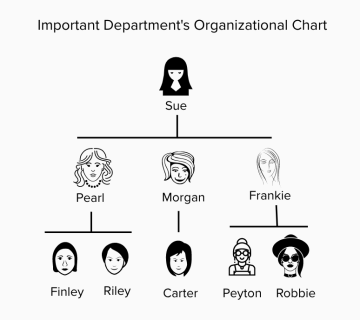
You could write this out in paragraph form
The Important Department's Organizational Chart is as follows; Sue is the head of the Important Department, and her direct reports are Pearl, Morgan and Frankie.
Pearl oversees Finley and Riley, Morgan oversees Carter and Frankie oversee Peyton and Robbie.
You could also convey the same information in a bulleted list
Important Department's Organizational Chart
- Sue
- Pearl
- Finley
- Riley
- Morgan
- Carter
- Frankie
- Peyton
- Robbie
- Pearl
If you can convey what is going on in your complex graphic in 255 characters or less, then you can describe your image in the caption field when you add the image to your text editor.
Example
This graphic visually represents how a taxonomy works for a content type.
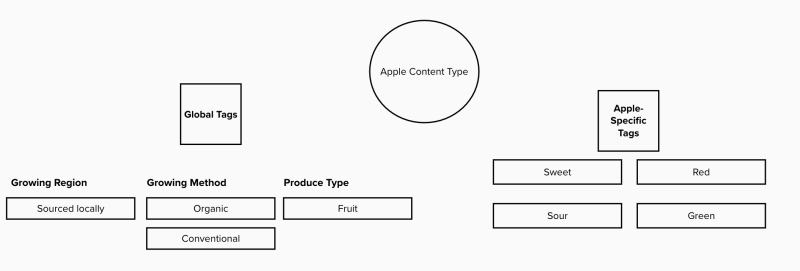
This approach balances having an element of visual interest while also presenting the bulk of the info in an accessible way in plain text on the page.
Original Version
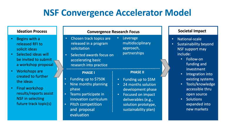
In this graphic, there is too much text to put in our alt text field, and there is too much text to put into a caption. We also know it may present issues for people using mobile devices.
If we show the graphic and also write out all of the text on the webpage, will that be the best experience we can provide all users? More than likely, it is not as it will be redundant and may be confusing.
Revised Version
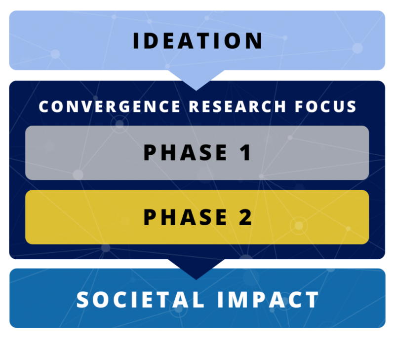
In this revised version, the graphic has been simplified to show the main steps in the process illustrated in the first graphic.
At 134 characters, we can include the following alt text to describe the image, "The convergence accelerator process includes ideation, two phases focused on convergence research, which will lead to societal impact."
The rest of the information can be conveyed in plain text on the webpage while still including the graphic for visual interest.
Copy and accessibility
The text component or other components with a text editor provide a lot of flexibility for your content. It is important to craft your content according to best practices for accessibility.
Adding links
- Avoid full urls on-page when possible. Instead, use descriptive link text.
- Avoid: https://beta.nsf.gov/funding/opportunities
- Instead: Search for NSF funding opportunities
- Why? Screen reading software reads out all of the link text on a page to a user. If you had a URL read to you without the context of the words around it, would a user know where that link will take them?
- Avoid phrases like click here, here, read more, or view more in your link text.
- Avoid link text "click here," "here" or "read more...." These words by themselves do not provide enough information about the destination. This issue is compounded if a page has multiple destinations using the same "click here" or "read more" link text.
- For more examples on writing active link text, see this W3C Tip for Webmasters.
Headings and readability
- Use proper heading hierarchy to add structure to your webpage. Learn how to add headings with the text editor.
- Avoid all caps - screen readers will read each letter as if it is an acronym.
- SO IF YOU WROTE THIS it would be read aloud letter-by-letter as S-O I-F Y-O-U W-R-O-T-E T-H-I-S.
- Avoid underlining text that is not a link - this can be confusing to users.
Plain language
The National Science Foundation is committed to ensuring all content on Beta adheres to federal plain language guidelines. If you have questions about these guidelines or how you can make your copy compliant, reach out to OLPA.